Afraid of a big canvas? Some artists are. The larger the format, the scarier the first strokes can feel. But I’ve realized that I might have the opposite problem. After painting this piece – measuring 150 x 150 cm – I’d honestly love to stand in front of an XXL canvas forever. Take a look at some photos from the process…
This is something I’ve always been drawn to – writing out a motivational quote or someone’s thoughts with a brush on a large canvas, big sheet of paper, or even on a wall. Just for the feeling, for the fun of it. It’s such a nice way to start every painting.
For this canvas, I chose a quote by Jan Werich (1905 – 1980). In English, it roughly translates to:
"People with imagination are never dangerous. Dangerous are only those who lack it – those who walk through life like a horse with blinders, unable to imagine that there might be something different from what they think there should be."

And then, I simply painted over the entire text. If you’re on Instagram, you can check out a video of the painting process on my profile.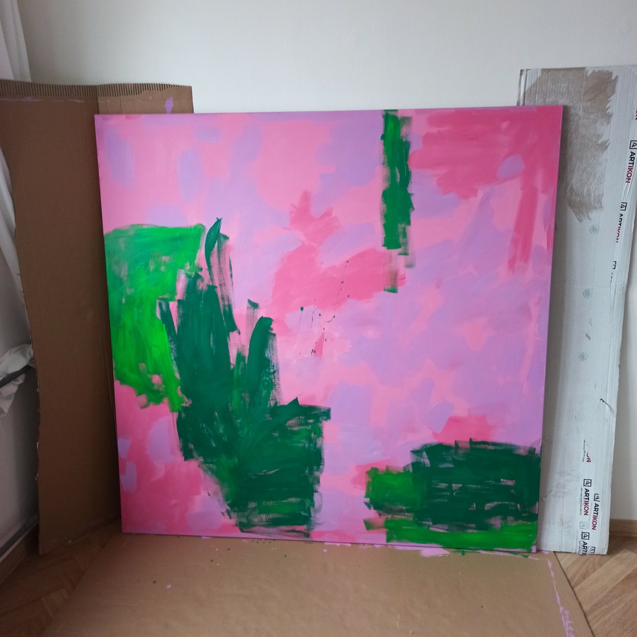
After I painted the base layer in pink (including the edges of the canvas), I began painting large areas in bold and relatively dark colors.
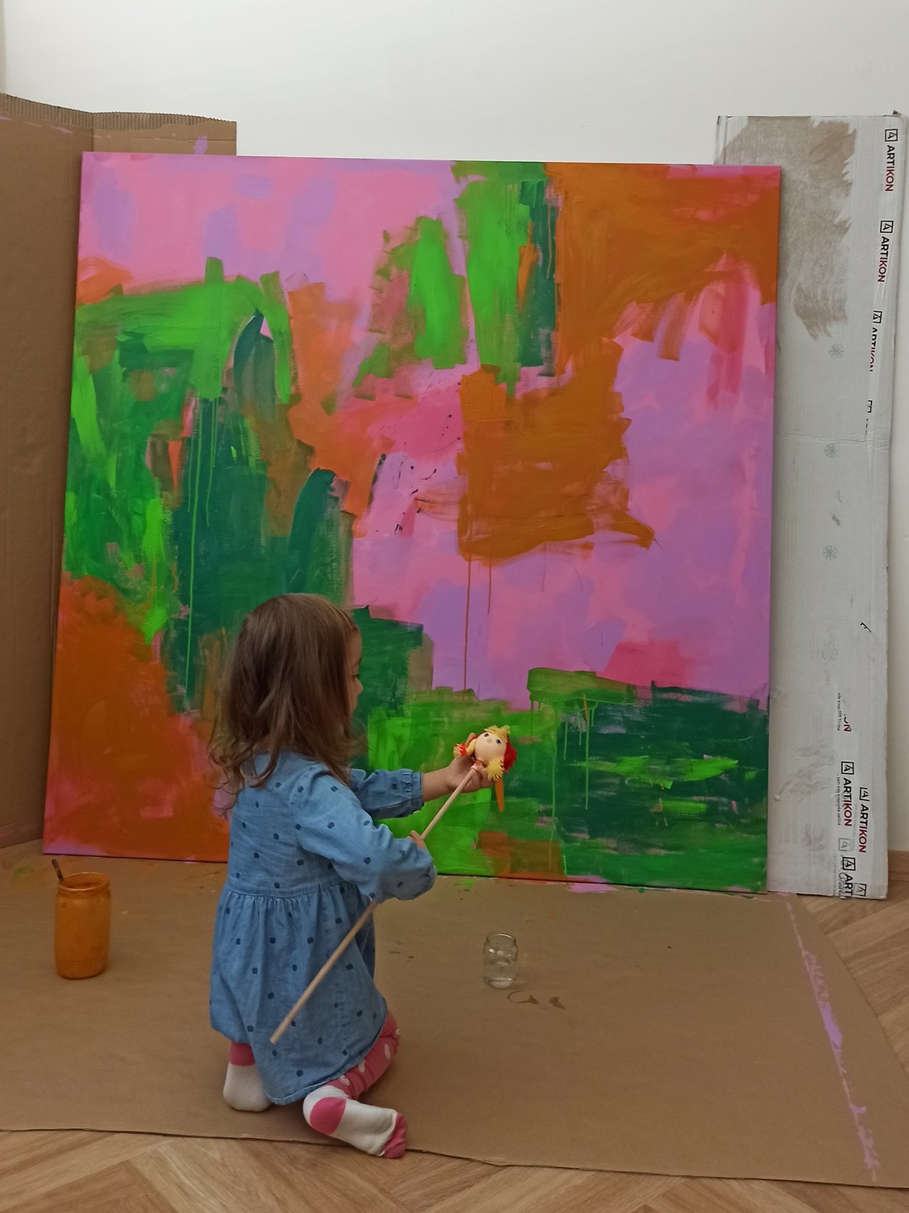
Of course, our daughter Laura couldn’t be left out! After all, I’m still partially on maternity leave, so a lot of my work is created with her nearby. In the photos, you can also see that besides using thick, undiluted paint, I sometimes thinned the acrylic with water to let it drip down the painting.
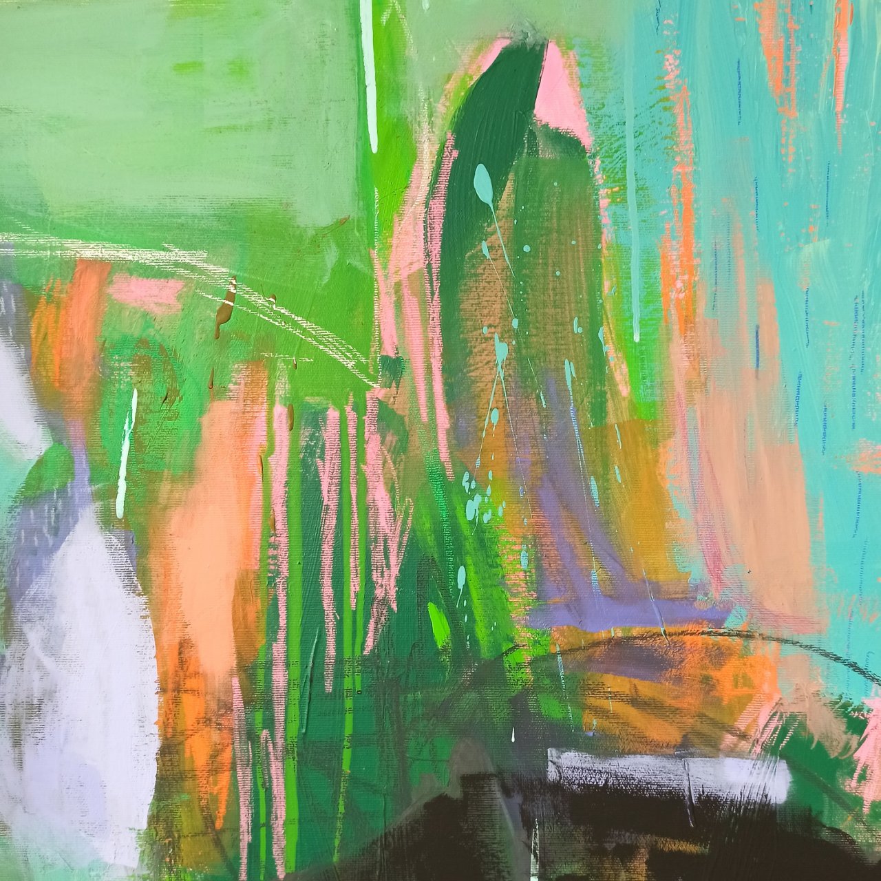
In some smaller spots within the orange areas, I used fluorescent orange acrylic paint – specifically Orange Fluorescent, 370, from the Pébeo brand. This was my first time working with this type of paint, and I think I’ll definitely be using it more often. Even though it only appears in a few small details, it really pops and adds an extra flair to the painting.
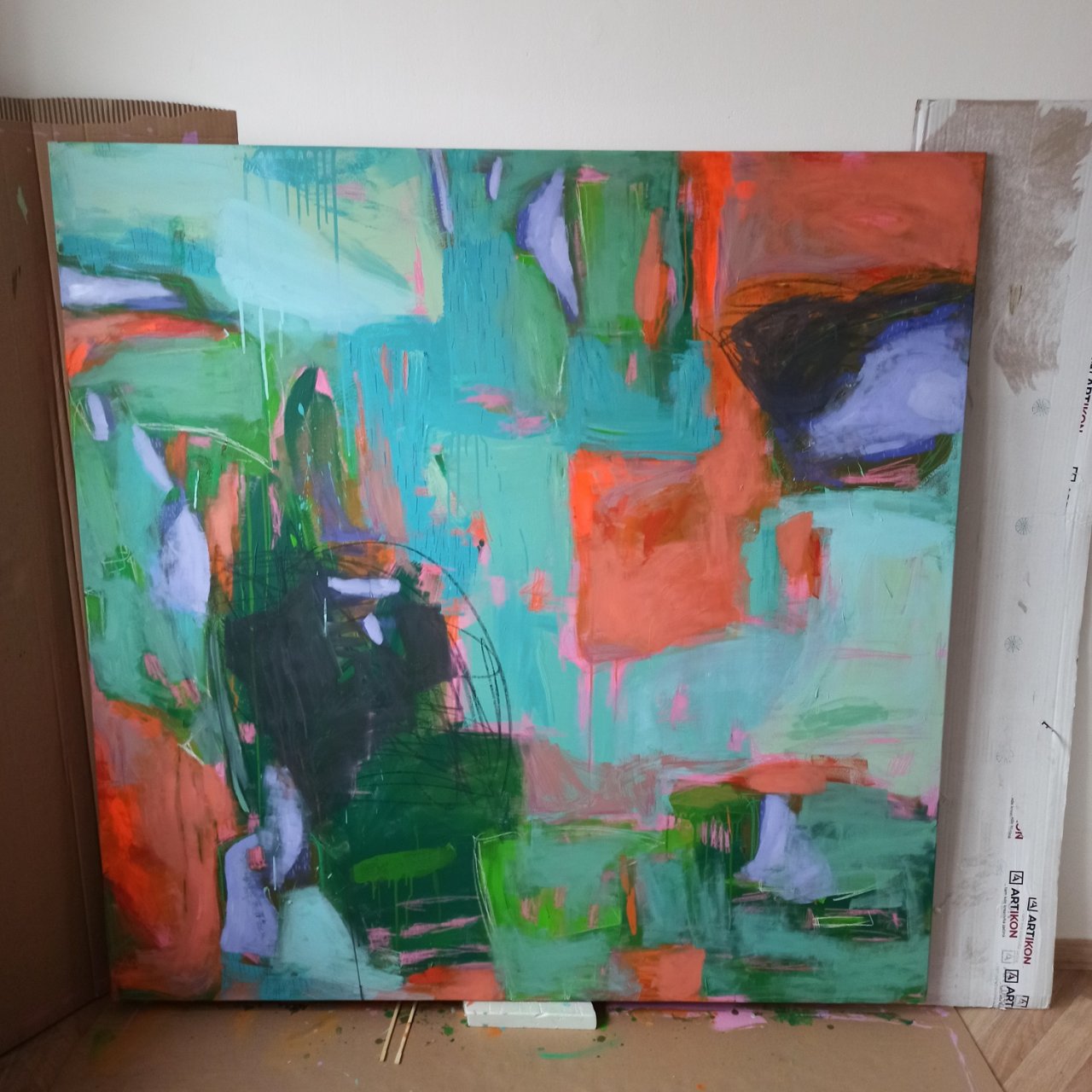
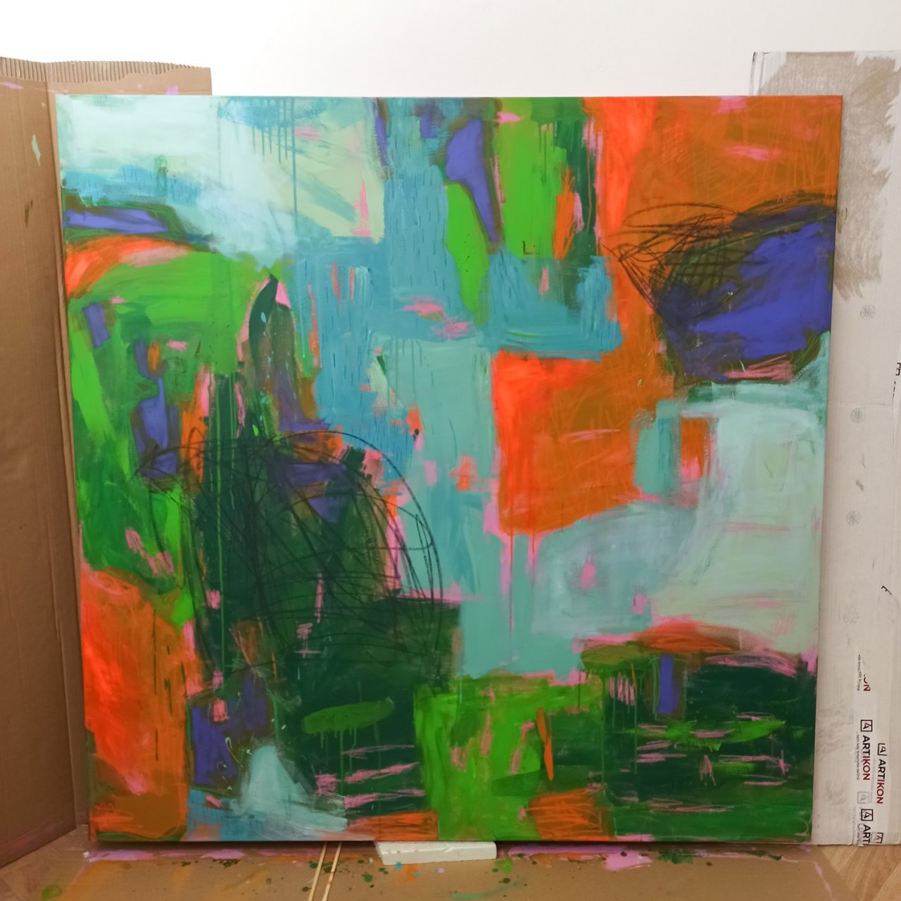
I added small details, lines, and strokes with soft pastels. Then, I started to brighten the entire painting with lighter shades of acrylic paint. I deliberately kept this layer very dry so I wouldn’t cover up all the details underneath.
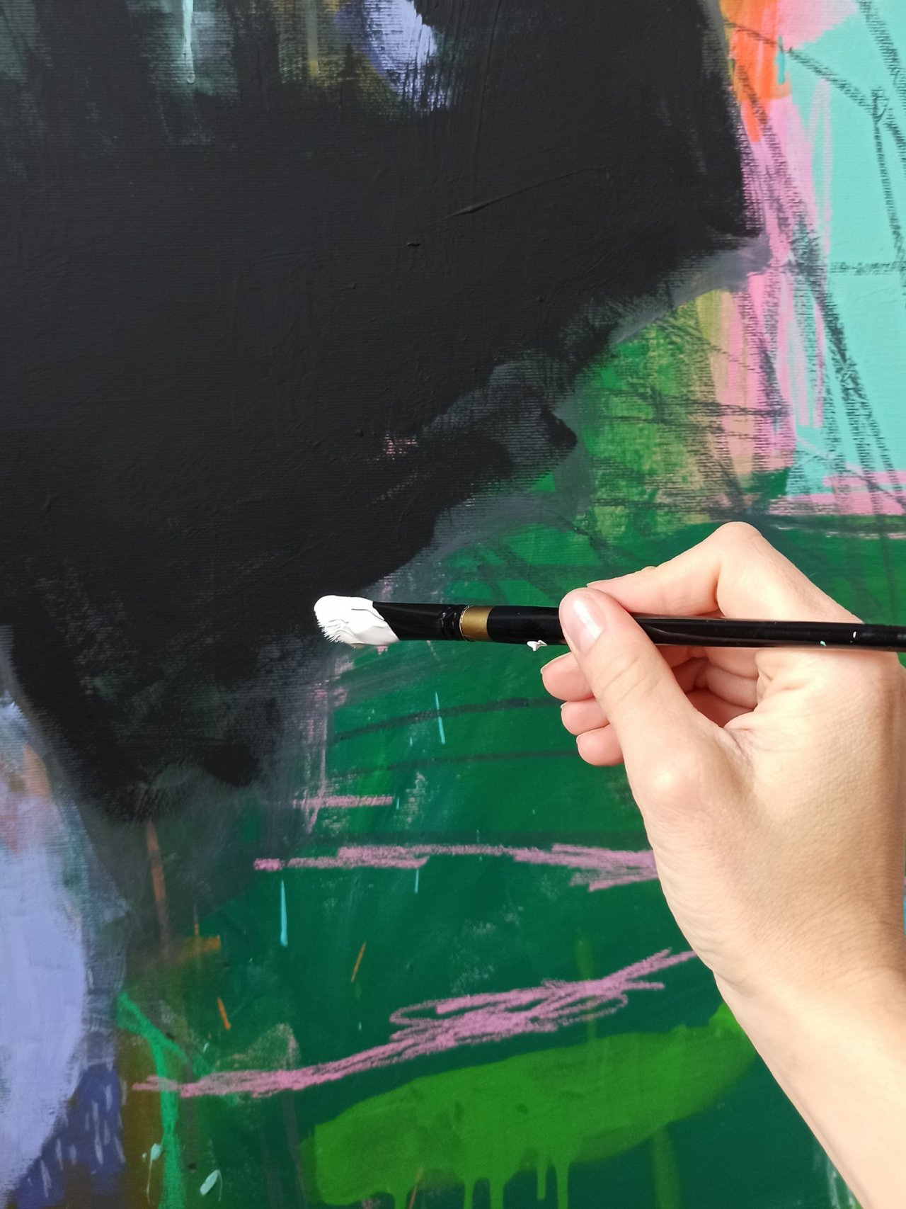
I used white paint at the very end. I can say that these two final white areas weighed on my mind for quite a while. You’re always afraid you’ll ruin everything – that you’ll cover something you won’t be able to bring back. So first, I made a smaller white area and then stepped back to reassess.
Tip ❤
In moments like this, I have a little trick. Sometimes it’s not enough to just step back a couple of meters and look at the painting from a distance. What really helps me is to take a photo of the painting and look at it on my phone. Even better is to view it just as a tiny preview in the gallery – like a small 2 x 2 cm picture. In that instant, I can see if the painting is missing something important, if it’s too dark or too light, or if it feels dull overall. It also helps me decide if I need to scale something down or up. That little thumbnail strips away the details and helps me focus on the big picture. It was so reassuring to hear that the painter Phoebe Gander does the same thing – I loved learning that on her Instagram.
Fixative
For the final version of the painting, I first sprayed it with a fixative varnish to protect the pastel work and prevent it from smudging. You have to be very careful with pastels – the fixative can slightly change their colors, and especially white pastel has a tendency to fade or lighten considerably. Once the pastel layer was stable thanks to the fixative, I used a finishing varnish. I saved the black areas for last and applied the varnish with a brush very gently, so that the black pastel wouldn’t smear into the colorful areas.
When working with acrylic paintings, using a fixative or final varnish can help protect the surface and ensure the longevity of your artwork. Fixatives are typically available in two main forms: spray fixatives and brush-on varnishes. Spray fixatives are easy to apply and create a thin, even layer that protects delicate areas, such as pastel or charcoal details layered over acrylics. Brush-on varnishes, on the other hand, provide a more durable, thicker finish and are often used as a final coat to unify the painting’s surface sheen. Some fixatives are matte, which helps to reduce glare and give the painting a softer appearance, while gloss fixatives can enhance color vibrancy and create a more striking finish. It’s important to choose a fixative that’s compatible with acrylics, as some fixatives designed for other mediums (like pastels or watercolors) might not offer the right level of protection or finish for acrylic paintings.
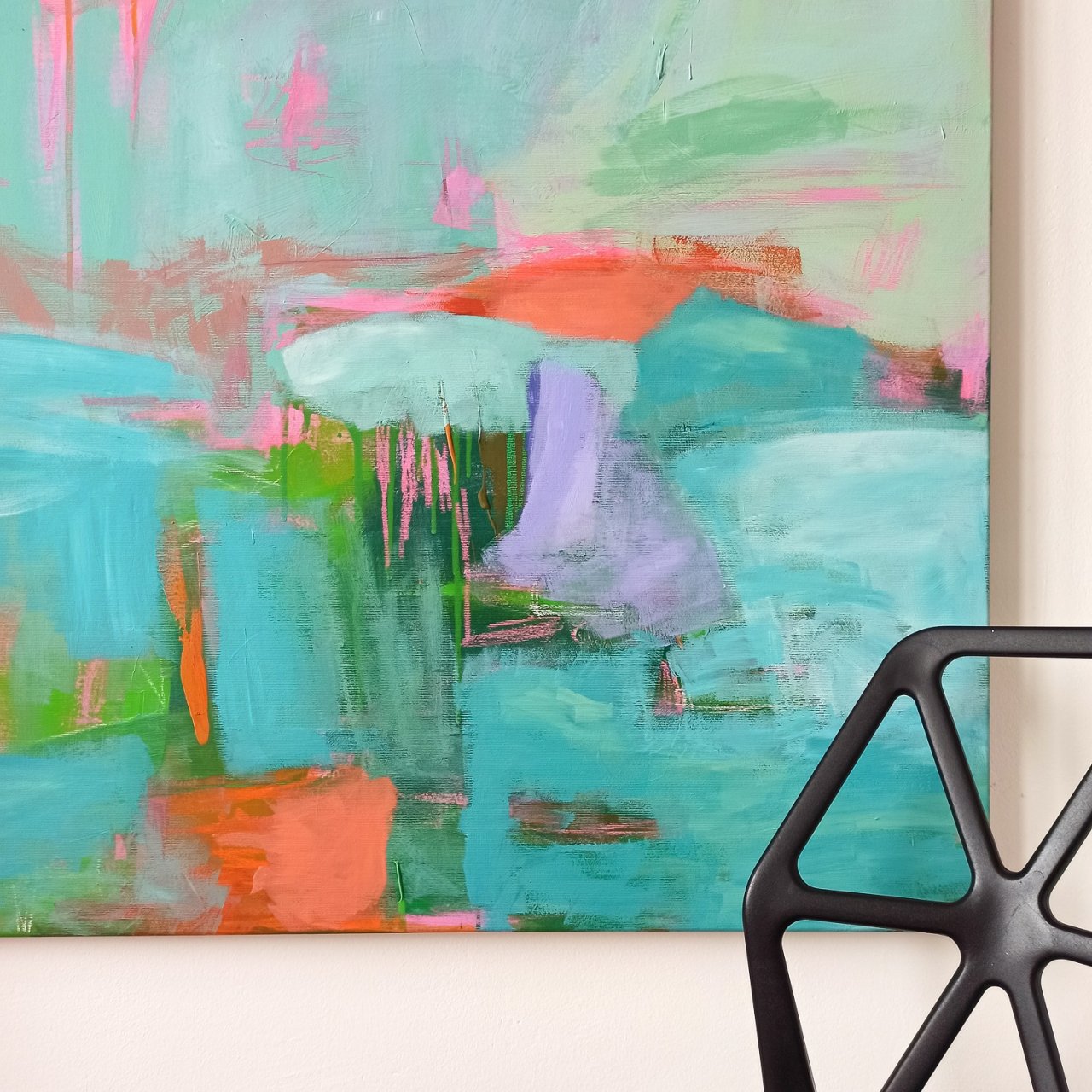
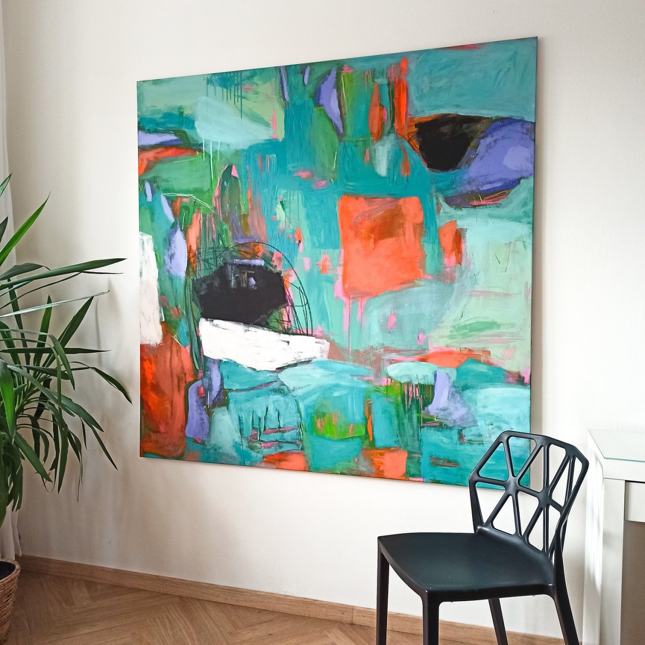
And the result? See for yourself. :)