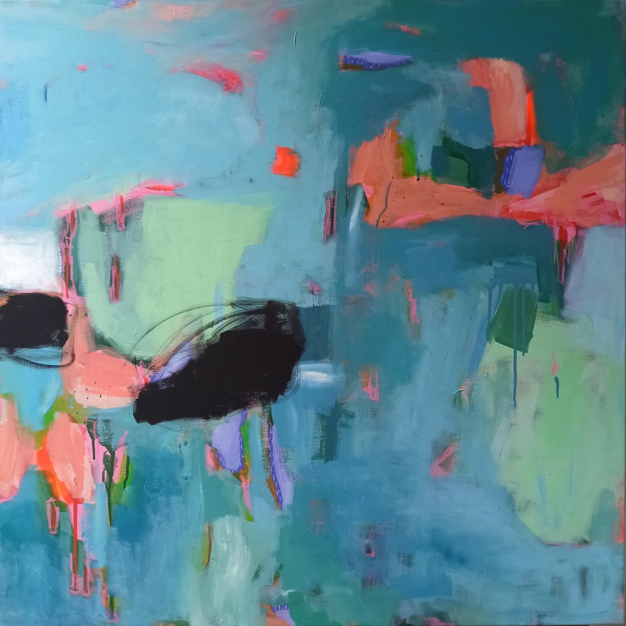
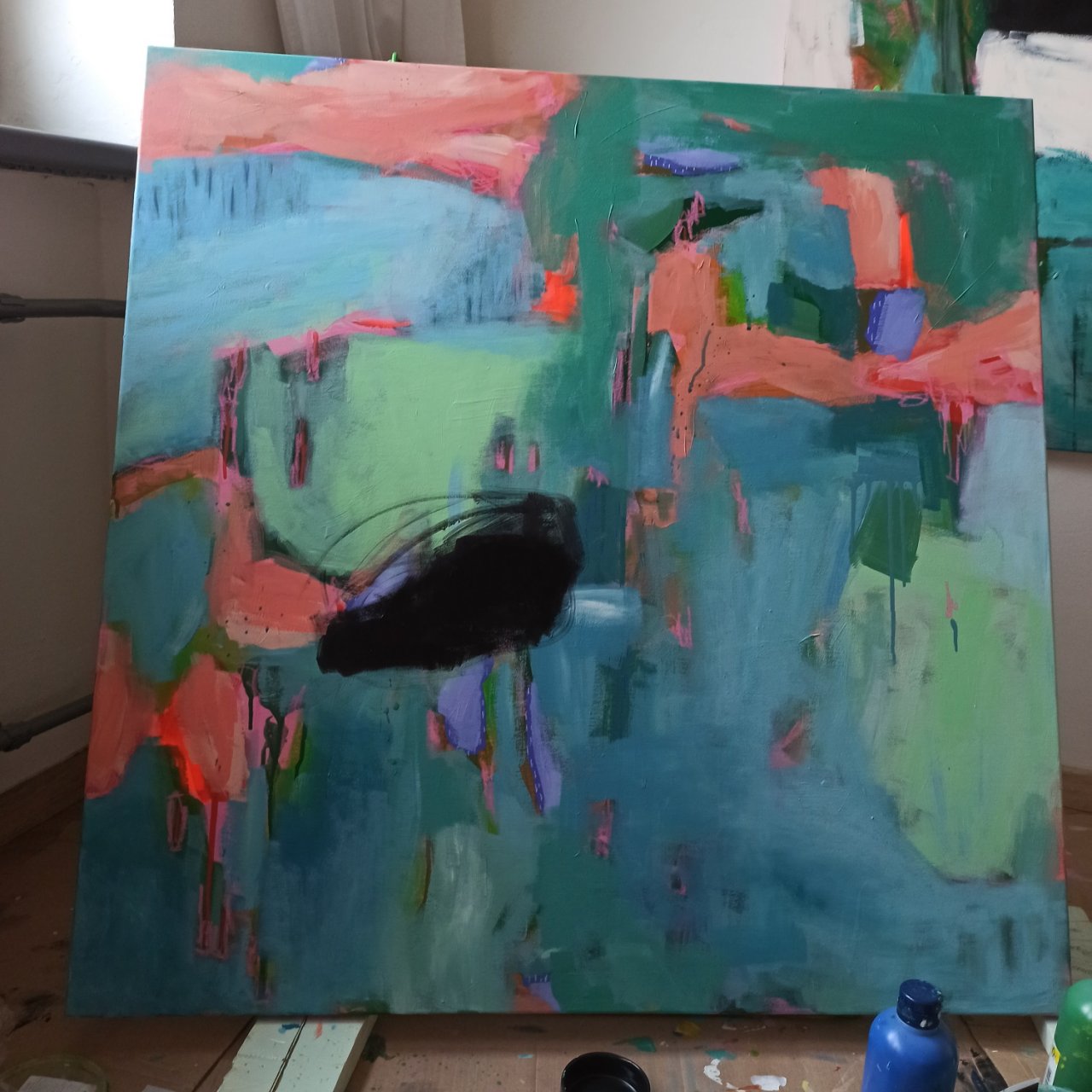
I think I’ve truly fallen in love with square formats! After completing a large abstract painting on canvas measuring 150 x 150 cm, I immediately started working on another one – this time 100 x 100 cm. I named it Mountain Lake.
As an artist specializing in contemporary abstract floral art and colorful acrylic paintings, I find that square formats allow me to play with balance and composition in a completely new way.
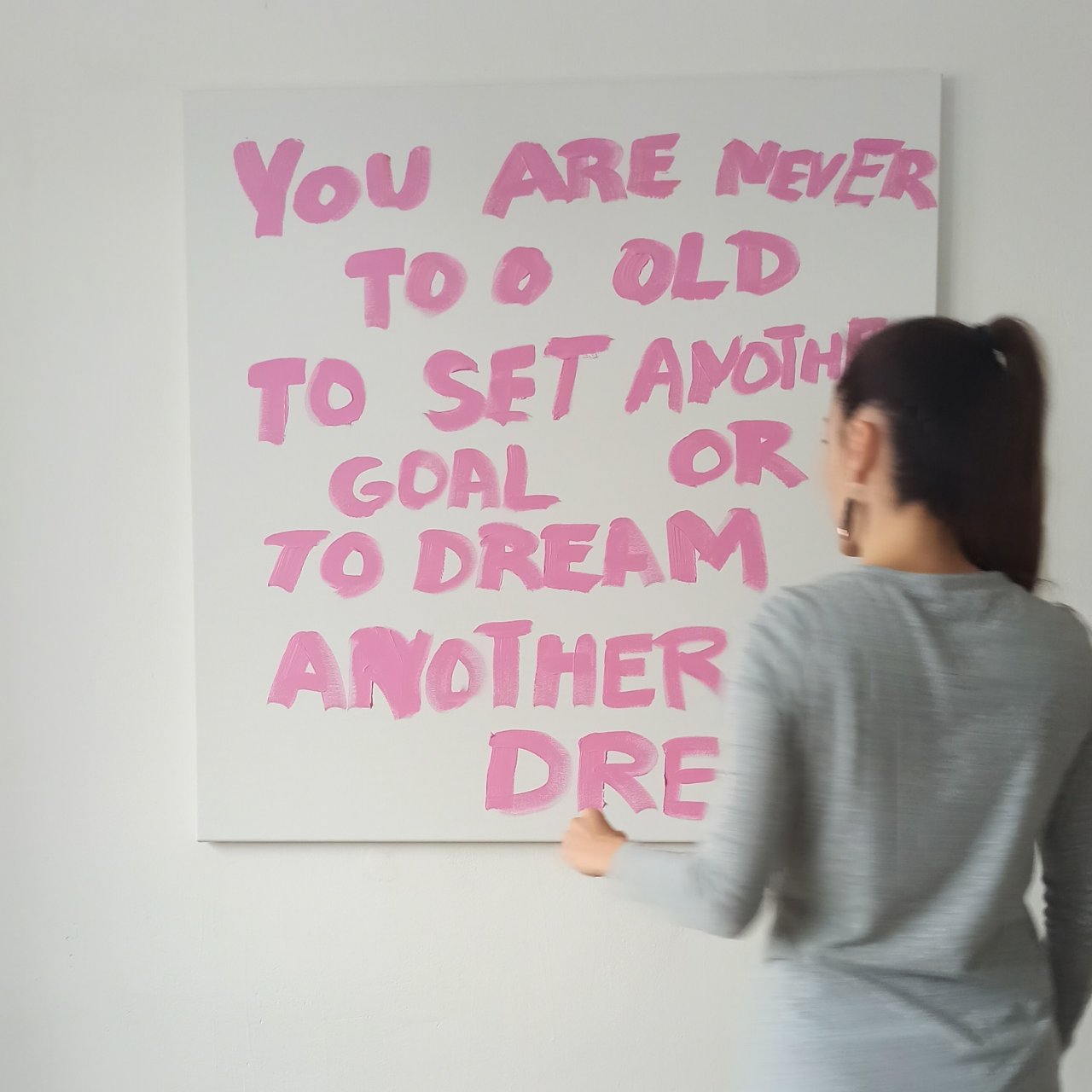
I started the painting with a pink layer and, of course, included a motivational quote. In English, it reads: "You are never too old to set another goal or to dream a new dream." I’d translate it like this: "Nikdy nejste příliš staří na to, abyste si vytyčili další cíl nebo snili nový sen." I always record a video while writing out the quote, because it makes great content for social media, especially for Instagram Reels.
Then, I covered the entire quote with pink paint, including the edges of the canvas. I like to leave little hints of pink peeking through in a few tiny spots in the final painting.
The technique of starting with a colored underpainting – known as a grisaille or imprimatura in traditional art – is widely used by many artists. It helps to unify the painting, create a sense of depth, and add subtle variations to the final colors. For me, the pink layer creates a sense of warmth and energy that shines through in the final work. In fact, artists like Mark Rothko, who often used colored ground layers in his color field paintings, and contemporary artists like Flora Bowley or Jessica Zoob also use vibrant underpaintings to bring an added dimension to their work.
Colors
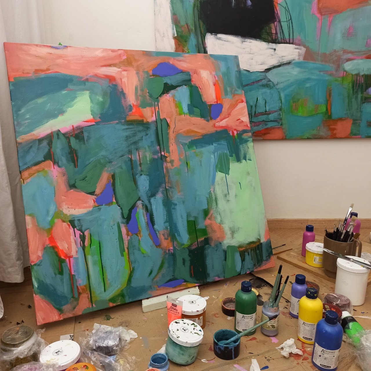
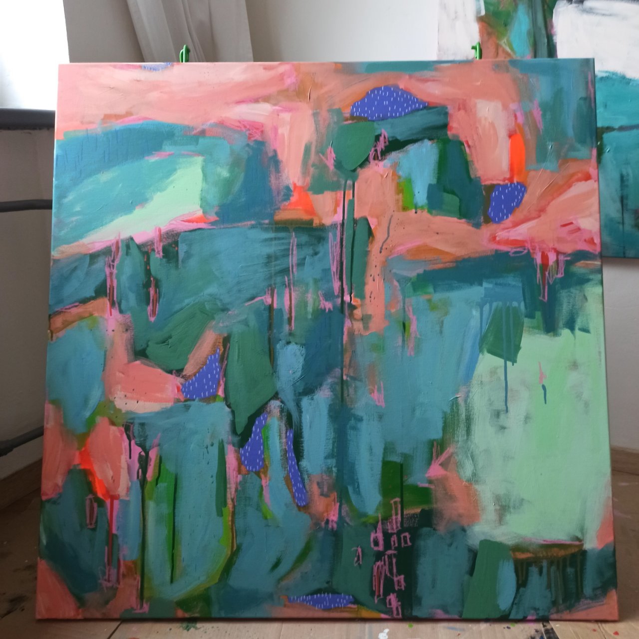
In the next stage, the painting looked pretty wild. I used fluorescent orange, salmon orange, bluish-purple (or more like violet), turquoise, and various ocean shades. Some of the mixed colors I diluted with water at the end and let them drip down the canvas. That’s also why I don’t use a traditional easel – it’s much easier for the drips to flow straight to the floor (or, rather, onto a protective paper board), and I prefer to sit while working.
Pastels
Next, I brought in soft pastels. This time, I skipped the black pastel because it tends to smudge during the final fixative spray. I also decided to give white pastel another chance, adding small white strokes on the violet areas. Unfortunately, most of it disappeared when I sprayed the fixative, so I touched up those areas later with a white acrylic marker. Pink pastel, on the other hand, always works well for me.
There are several types of pastels, each with its own character and use. Soft pastels have a high pigment content and produce vivid, painterly marks, but they’re also more fragile and prone to smudging. Hard pastels have less pigment and a firmer texture, making them great for detailed lines and layering over softer pastel work. Oil pastels contain a waxy binder, giving them a creamy, blendable quality – they don’t smudge like soft pastels, but they also don’t require fixative spray. Lastly, pastel pencils combine the control of a pencil with the vibrant pigment of soft pastels, offering precision for fine details and sketching.
Black and White
I usually save black areas for the very end – if I even use them at all. This time, though, I wanted to see them earlier in the painting so I could better think about the whole composition. Recently, someone told me they saw a table and chair in the black shapes of the painting. After that, I added a small area of pure white above the black, and started to brighten up the entire painting with lighter shades.
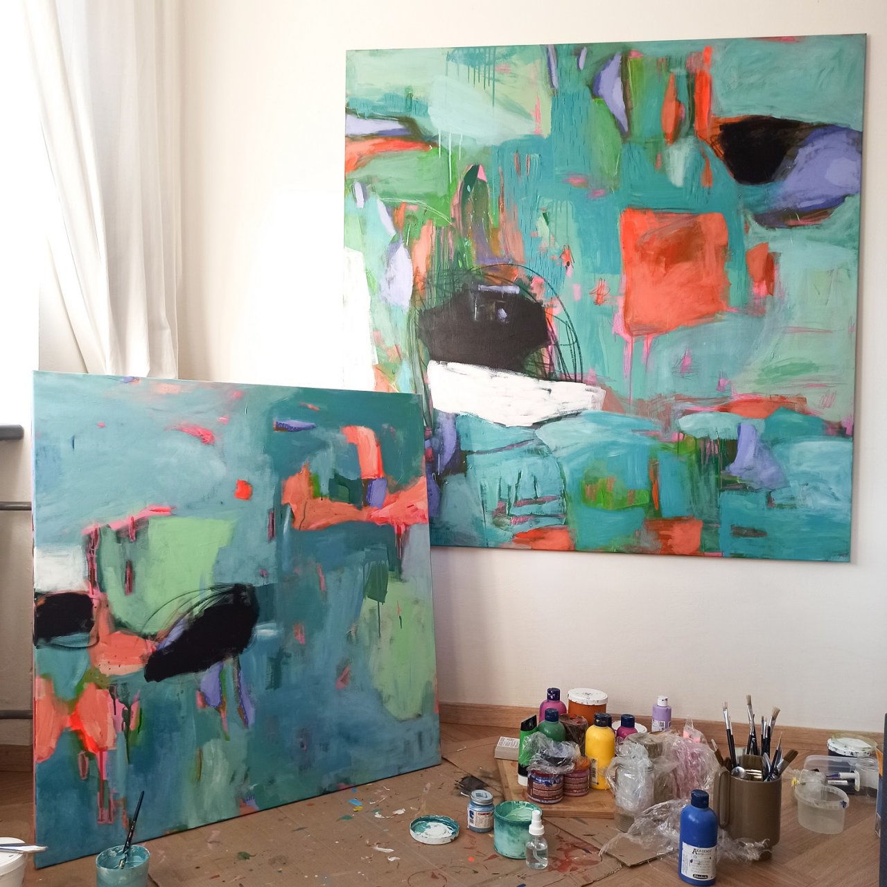
And the result? See for yourself.