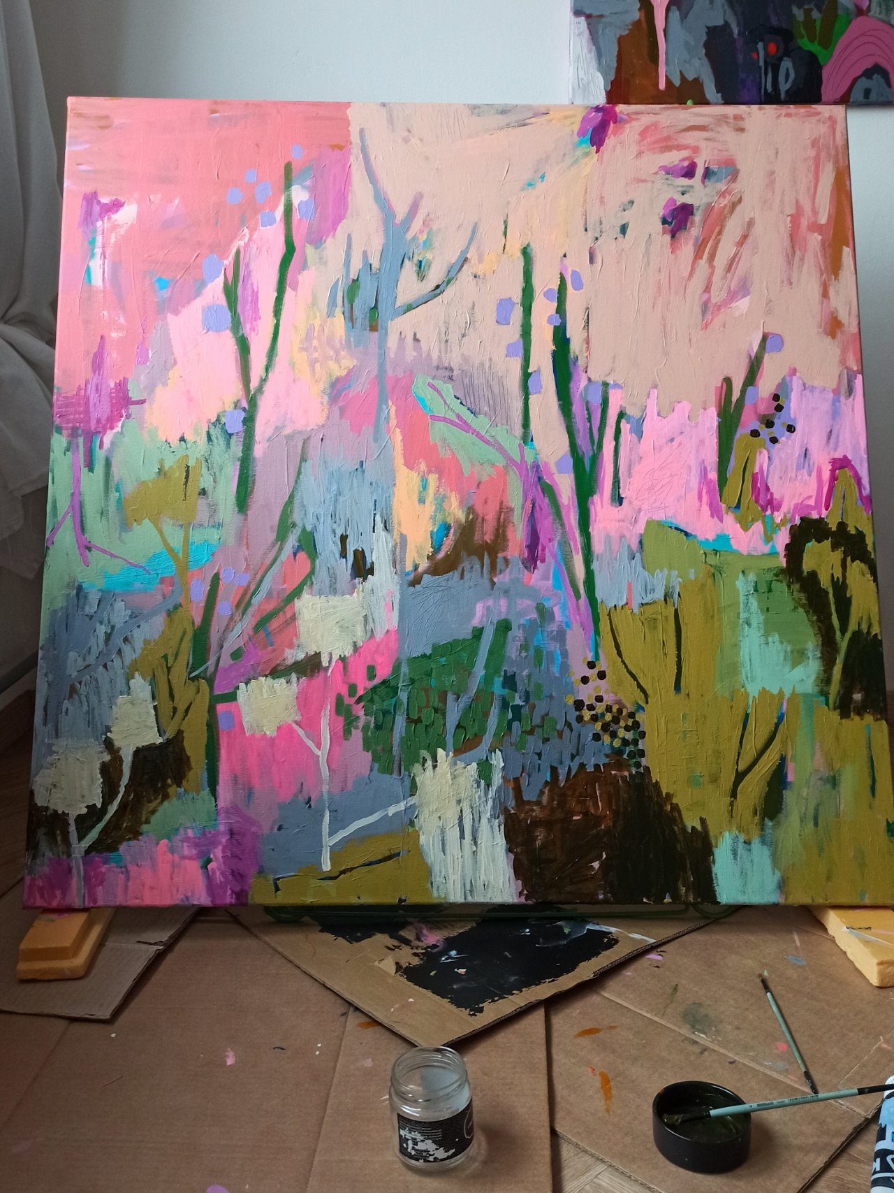
It wasn’t planned at all – to create a painting in the colors of spring. It just happened. In this article, you’ll read about – and most importantly, see – my painting process. The painting is 100 x 100 centimeters and was created using acrylic paints.
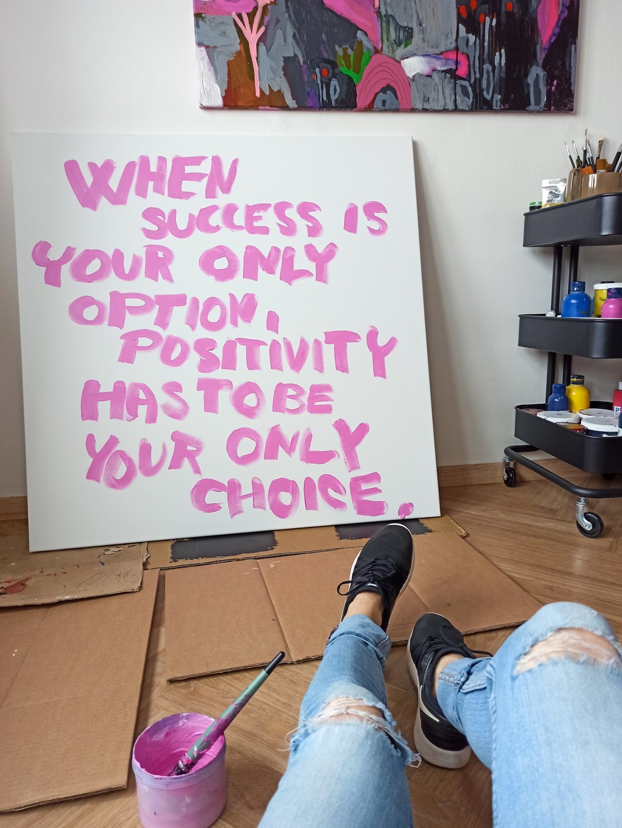
Step 1: The First Layer
It’s become a habit of mine – and maybe even a signature – to start the first layer of my paintings in pink. I love when pink peeks through here and there. It’s my color, and it just feels like part of me. To keep it from feeling too plain, I often begin with a quote – which, by the way, makes for great content on social media, especially in Reels videos on Instagram.
“When success is your only option, positivity has to be your only choice,” once said Germany Kent, an American journalist. In Czech, this roughly translates to: “Pokud je úspěch vaší jedinou možností, tak pozitivita musí být vaší jedinou volbou.” Believe it or not, I’m more of a realist with a tendency toward pessimism. But I’m also a dreamer with many plans, so I’ve prescribed myself optimism instead of vitamins.
Step 2: Choosing Colors and a Motif
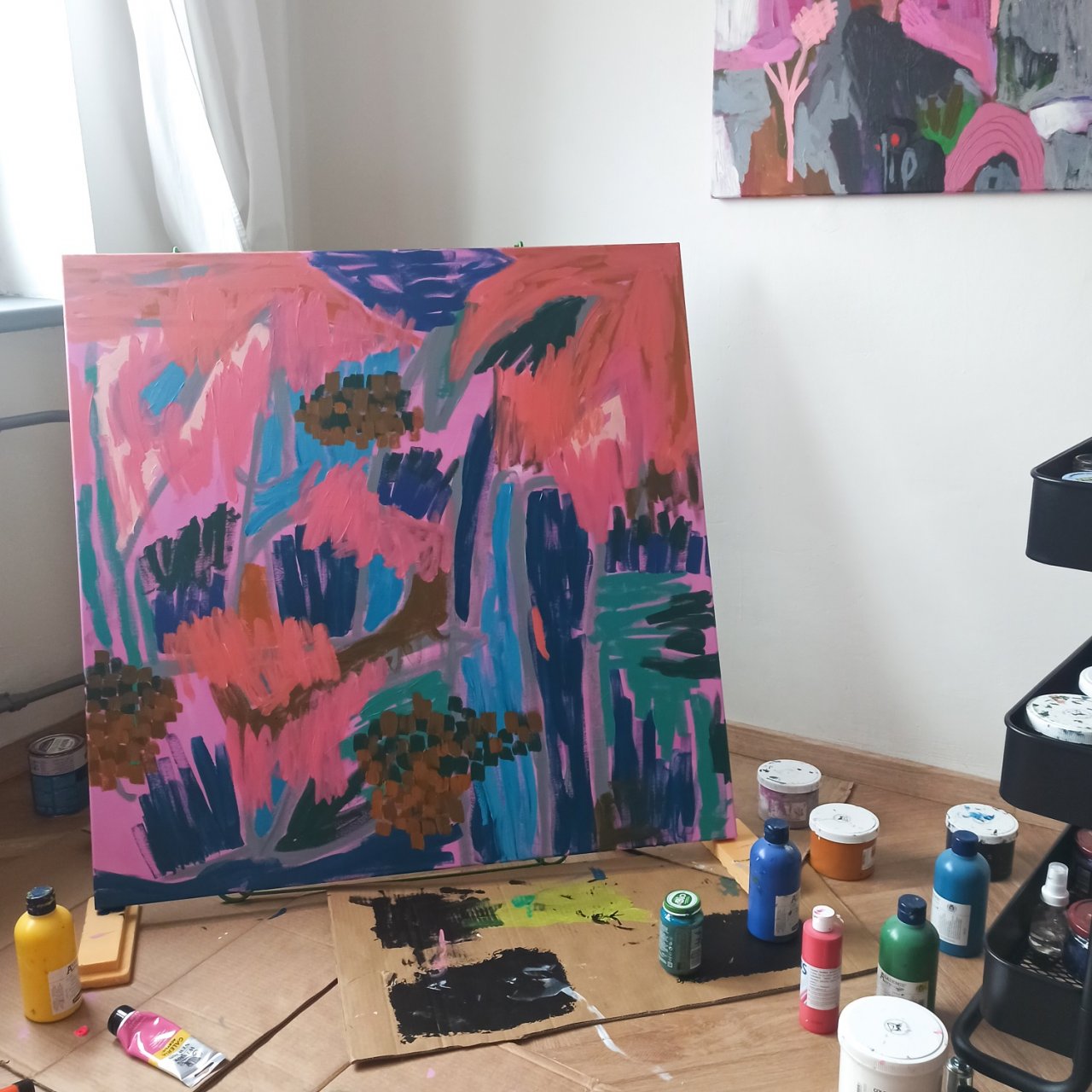
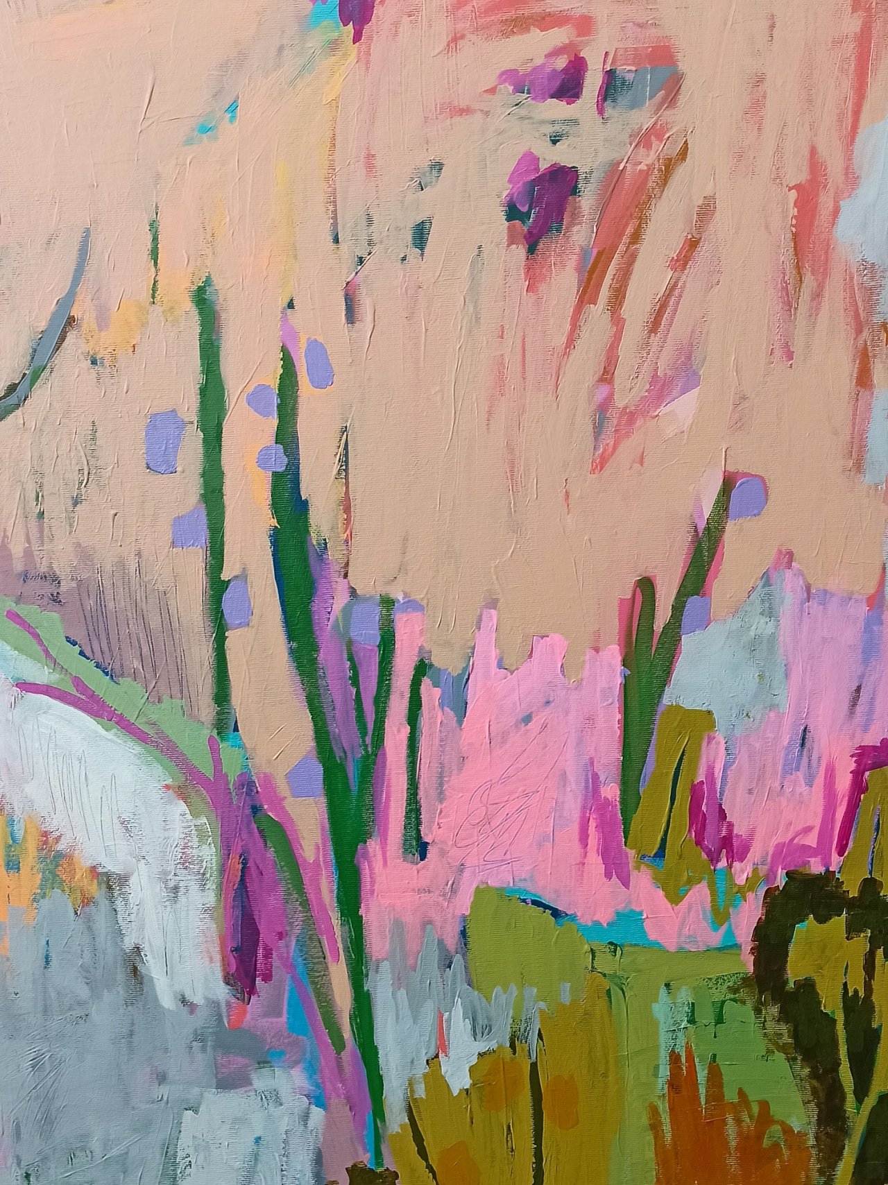
I wanted to paint something that would feature nature and build on my earlier work, My Secrets. My plan was to combine turquoise, green, orange, gray, and pink. So I started with those colors, but used darker shades in the beginning. Right from the start, I chose brushstrokes that would evoke a sense of growth – like grass, bushes, flowers, and trees.
Step 3: The Fun Part
This is always the phase of the painting where I really have fun and experiment a lot. Acrylic has this great quality – it dries quickly, but you can also paint over it beautifully. I added more turquoise, gray, and several shades of green. The first plants started to appear on the canvas. In this phase, you’ll see a lot of yellow, although I ended up getting rid of most of it later. Still, it pops out in a few places in the final painting – playing its own little role.
By the way, the can you see in the photo isn’t paint or spray – it’s Solevita organic juice from Lidl. It recharges me when I’m not in the mood for coffee. Highly recommended!
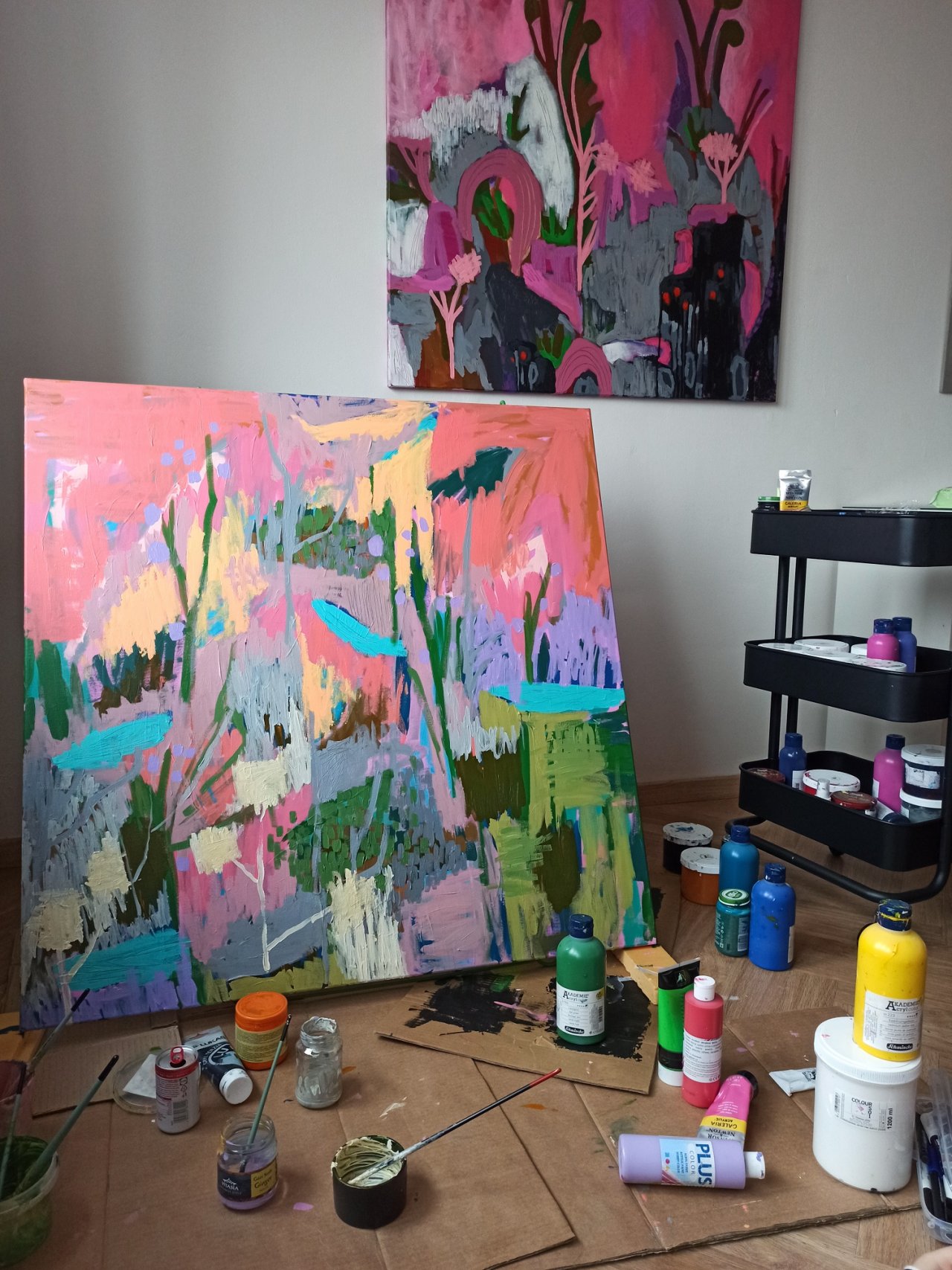
Step 4: Goodbye to Blue
This is where olive green – my big love in this painting – comes in. It’s a mix of orange and green, and I find it absolutely perfect. I also added fluorescent pink, but I kept it restrained. You know how I feel about pink. :) At this point, I also realized I didn’t want the painting to be blue. The turquoise and regular blue suddenly started to bother me, so I covered them with other colors. Still, I left hints of blue peeking through in some places.
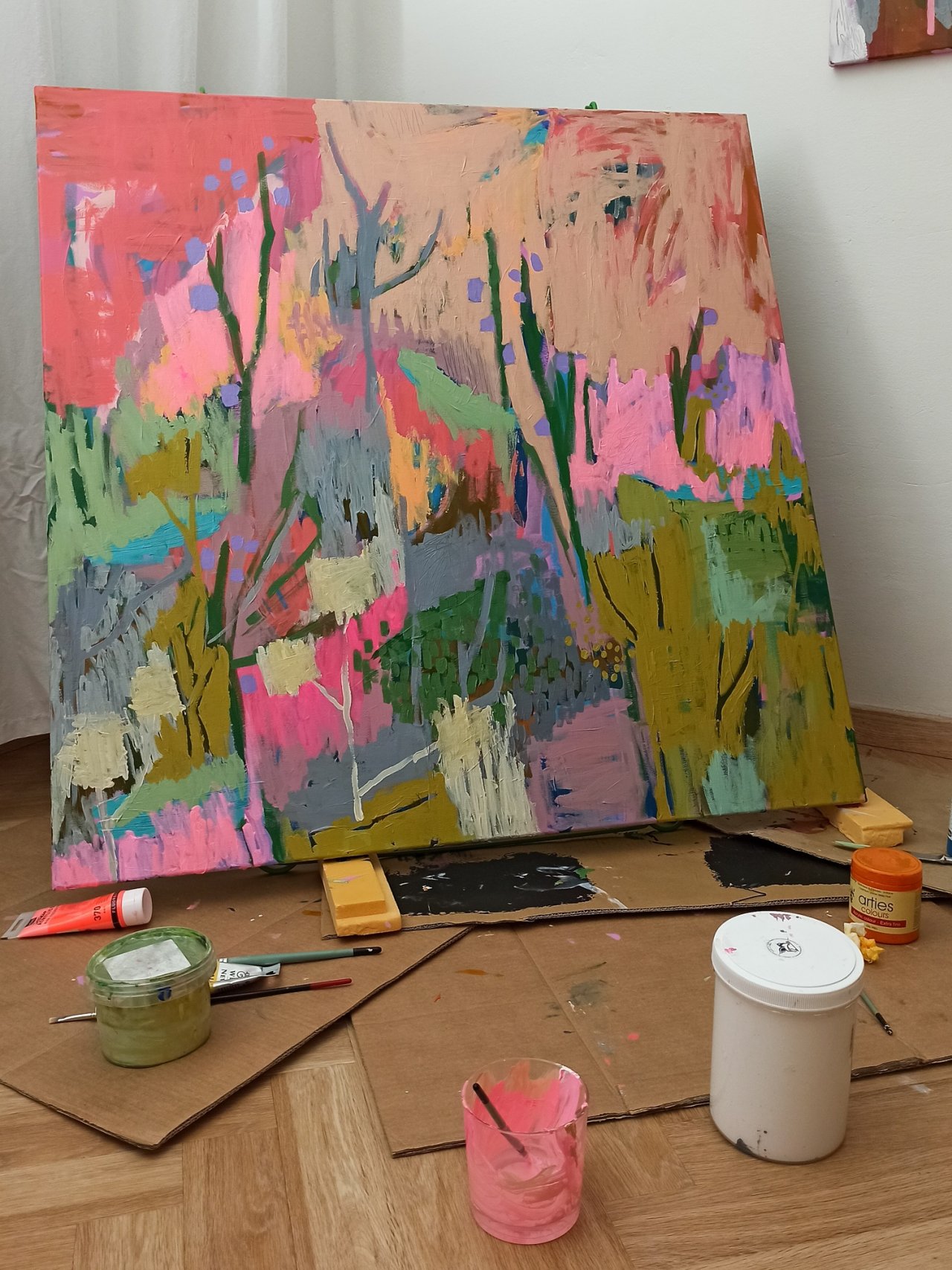
Step 5: Dark Areas in the Painting
This time, I didn’t use classic black paint. Instead, I darkened the already-present olive green. I thought a lot about how to use the dark color in the painting. In the end, I decided it would be interesting to use it to highlight the plants in the piece.
Step 6: White Paint
Pure, clean white paint. I added it to the top – the "sky" – and also to the center of the painting. It beautifully brightened up the whole piece.
And the result? See for yourself – you can find it [here].
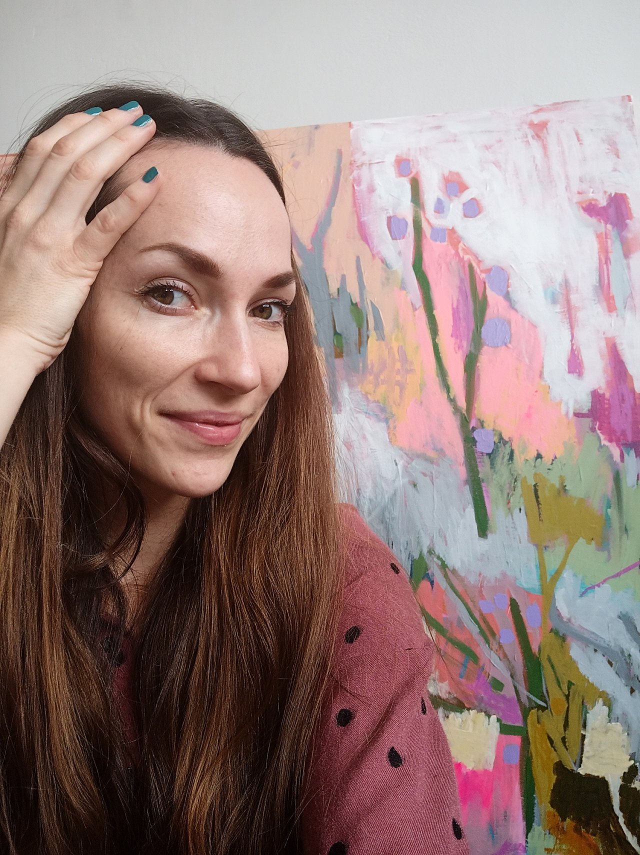
Simona
P.S.: The colors of the photos, and therefore the painting, may vary because I painted and photographed at different times of the day.